When preparing a home for sale or simply looking to refresh your living space, choosing the right paint color can make all the difference. Colors evoke emotions, affect mood, and even influence perceptions of space and light. By understanding the science of color and the impact of different hues, homeowners in Upper St. Clair, PA, can create inviting, balanced rooms that appeal to both personal taste and potential buyers. Let’s dive into how to select the perfect paint tones to enhance every room in your home.
1. Understanding Color Psychology
Color psychology is essential when deciding on paint tones, especially if you’re aiming to attract buyers. Every color has the power to evoke a certain mood:
- Warm Colors: Tones like red, orange, and yellow add warmth and can make a space feel more energized or cozy, depending on the shade.
- Cool Colors: Blues, greens, and purples tend to calm and relax, making them ideal for bedrooms or spaces where you want a serene ambiance.
- Neutral Colors: Whites, grays, beiges, and soft browns create a blank canvas and are highly versatile. Neutral shades work well in nearly every room and allow buyers to envision their own furnishings and décor.
*Now: * keep this in mind as we explore the best color options for each room in your home.
2. Creating an Inviting Entryway
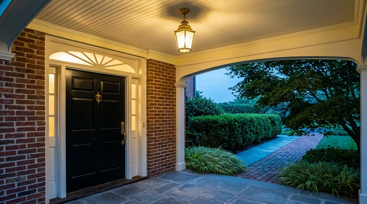
The entryway sets the tone for the entire home. It’s the first impression, so selecting a color that feels welcoming and balanced is key. Light, neutral shades like soft gray or pale beige can make an entryway feel airy and open, even in small spaces. Alternatively, deeper shades such as charcoal or navy can lend a touch of sophistication without overwhelming visitors.
For those who enjoy a pop of color, adding a rich accent wall in a warm shade like terracotta or burnt orange can create a welcoming vibe. Just make sure to balance it with lighter trim and décor.
For those who enjoy a pop of color, adding a rich accent wall in a warm shade like terracotta or burnt orange can create a welcoming vibe. Just make sure to balance it with lighter trim and décor.
3. Setting the Right Mood in the Living Room
Living rooms are the hub of activity in many homes, so a color that feels warm and inviting without overwhelming the senses is ideal. Neutral shades like soft taupe or creamy beige work well, allowing furnishings and décor to stand out. These tones also appeal to a broad audience, which is a bonus if you’re planning to sell.
If your style leans toward bolder choices, consider a subtle accent wall in muted green or dusty blue. These hues add a touch of personality while remaining understated enough to maintain a relaxed atmosphere.
If your style leans toward bolder choices, consider a subtle accent wall in muted green or dusty blue. These hues add a touch of personality while remaining understated enough to maintain a relaxed atmosphere.
4. Choosing Soothing Colors for Bedrooms
Bedrooms should be a sanctuary—a place to unwind and rest. Cool colors, particularly soft blues, greens, and even light purples, are widely recognized for their calming effects. Pale blue walls, for example, can evoke a serene, spa-like quality that is perfect for relaxation.
The best part? * Light, cool colors can also make a room feel larger, making them ideal for smaller bedrooms. Pair these with white trim or neutral bedding for a cohesive, airy look.
For those wanting a bit more warmth, consider a muted shade like lavender or sage. These tones still promote calm but add a hint of warmth that can feel cozy on chilly evenings.
The best part? * Light, cool colors can also make a room feel larger, making them ideal for smaller bedrooms. Pair these with white trim or neutral bedding for a cohesive, airy look.
For those wanting a bit more warmth, consider a muted shade like lavender or sage. These tones still promote calm but add a hint of warmth that can feel cozy on chilly evenings.
5. Creating an Energizing Kitchen
Kitchens are often filled with activity, and color can play a role in enhancing this lively atmosphere. Warm, vibrant shades, like shades of yellow or even soft coral, can create a cheerful and energetic environment.
On the other hand: * for a more contemporary look, consider cool colors like a soft mint or muted gray-green, which can bring a fresh and clean feeling to the kitchen. Grays and whites are also popular in modern kitchens, especially when paired with metallic accents or natural wood finishes. These tones keep the space bright and appealing to potential buyers.
On the other hand: * for a more contemporary look, consider cool colors like a soft mint or muted gray-green, which can bring a fresh and clean feeling to the kitchen. Grays and whites are also popular in modern kitchens, especially when paired with metallic accents or natural wood finishes. These tones keep the space bright and appealing to potential buyers.
6. Setting the Ambiance in the Dining Room
The dining room is where people come together, making it an ideal place for colors that encourage comfort and sociability. Rich, warm tones like deep red or earthy brown are traditional choices for dining rooms, as they create a cozy, welcoming ambiance.
For a modern twist, consider a dark, moody green or a slate gray. These hues are both sophisticated and versatile, adding elegance without overpowering the room. Just remember, if you choose a bold shade for the walls, balance it with lighter trim or accents to avoid making the space feel too enclosed.
For a modern twist, consider a dark, moody green or a slate gray. These hues are both sophisticated and versatile, adding elegance without overpowering the room. Just remember, if you choose a bold shade for the walls, balance it with lighter trim or accents to avoid making the space feel too enclosed.
7. Bringing Tranquility to Bathrooms
Bathrooms benefit from cool, fresh colors that suggest cleanliness and calm. Light blues, soft grays, and seafoam greens are top choices for creating a spa-like ambiance. These colors also reflect light well, helping even small bathrooms feel more open.
White is another timeless option for bathrooms, particularly when used on trim or cabinetry. Pairing white with a gentle pastel wall color or subtle accent tile can add a bit of character while maintaining a clean, polished look.
White is another timeless option for bathrooms, particularly when used on trim or cabinetry. Pairing white with a gentle pastel wall color or subtle accent tile can add a bit of character while maintaining a clean, polished look.
8. Crafting a Productive Home Office
As remote work becomes more common, creating an inspiring home office has become essential. The colors you choose for this space can have a noticeable effect on productivity and focus.
*Here’s the interesting part: * certain shades are known for enhancing concentration. Muted greens and soft blues, for instance, are relaxing yet alert colors that help maintain focus over long hours. For a more energized workspace, consider light shades of yellow or warm neutrals like beige. These tones feel bright and uplifting without being too distracting.
If you’re interested in making a style statement, a dark accent wall in navy or charcoal can create a sophisticated, professional look—especially when paired with light-colored furnishings and décor.
*Here’s the interesting part: * certain shades are known for enhancing concentration. Muted greens and soft blues, for instance, are relaxing yet alert colors that help maintain focus over long hours. For a more energized workspace, consider light shades of yellow or warm neutrals like beige. These tones feel bright and uplifting without being too distracting.
If you’re interested in making a style statement, a dark accent wall in navy or charcoal can create a sophisticated, professional look—especially when paired with light-colored furnishings and décor.
9. Choosing the Right Finish
Once you’ve selected your colors, choosing the correct paint finish is the final step in achieving the desired effect. Here are a few guidelines:
- Matte/Flat: Ideal for low-traffic areas like bedrooms and ceilings. This finish hides imperfections but can be harder to clean.
- Eggshell: A good choice for living rooms and dining rooms. It has a slight sheen, making it easy to clean without reflecting too much light.
- Satin: Great for kitchens and bathrooms, where durability and easy cleaning are essential.
- Semi-Gloss and Gloss: Perfect for trim, doors, and moldings. These finishes are durable and reflect light, adding a polished touch to details.
10. Avoiding Common Color Mistakes
Selecting paint tones isn’t always straightforward. Homeowners can avoid common missteps with a few helpful tips:
- Testing Colors: Before committing, test colors on your walls. Observe how they look in different lighting throughout the day, as natural and artificial lighting can dramatically change the appearance of colors.
- Keeping Balance: Avoid choosing overly dark colors in rooms that lack natural light, as they can make the space feel smaller and closed in.
- Considering Resale Value: If selling is on the horizon, stick with versatile, neutral colors that appeal to a broad audience.
The Bottom Line
Whether preparing a home for sale or simply updating a space, the right colors can transform any room. By understanding color psychology, room functionality, and how lighting interacts with each hue, homeowners in Upper St. Clair can create a cohesive, stylish, and inviting home.
Contact Lauren Coulter
Ready to elevate your home’s appeal with the perfect color choices? Lauren can offer professional guidance on preparing your home for sale in Upper St. Clair, from color selections to staging strategies. Her expertise ensures your property appeals to buyers, increasing the likelihood of a quick, profitable sale.
Lauren and her team are dedicated to making each step of the selling process smooth and rewarding. Reach out today to explore how her skills and insights can make your home shine in the market.
Lauren and her team are dedicated to making each step of the selling process smooth and rewarding. Reach out today to explore how her skills and insights can make your home shine in the market.